The journey
One account, the whole course of care.
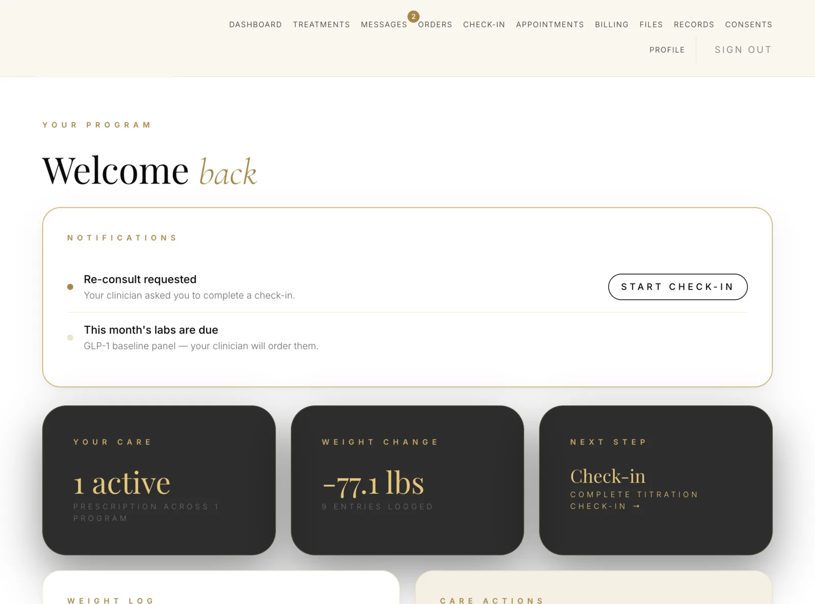
Patients don't want a portal. They want to start a program, be seen, get their medication and ask a question when something changes. The portal is organized around those four things.
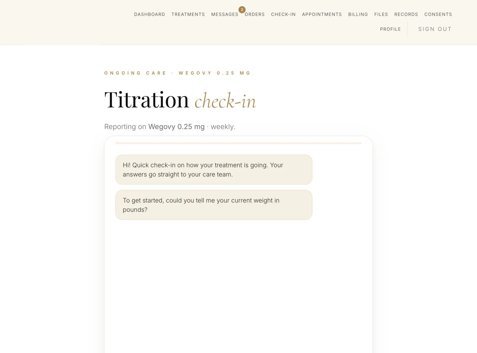
Conversational intakeProgram-specific questionnaires that branch on answers, save as the patient goes, and resume on another device. Clinical eligibility is screened as they complete it — not after they've paid.
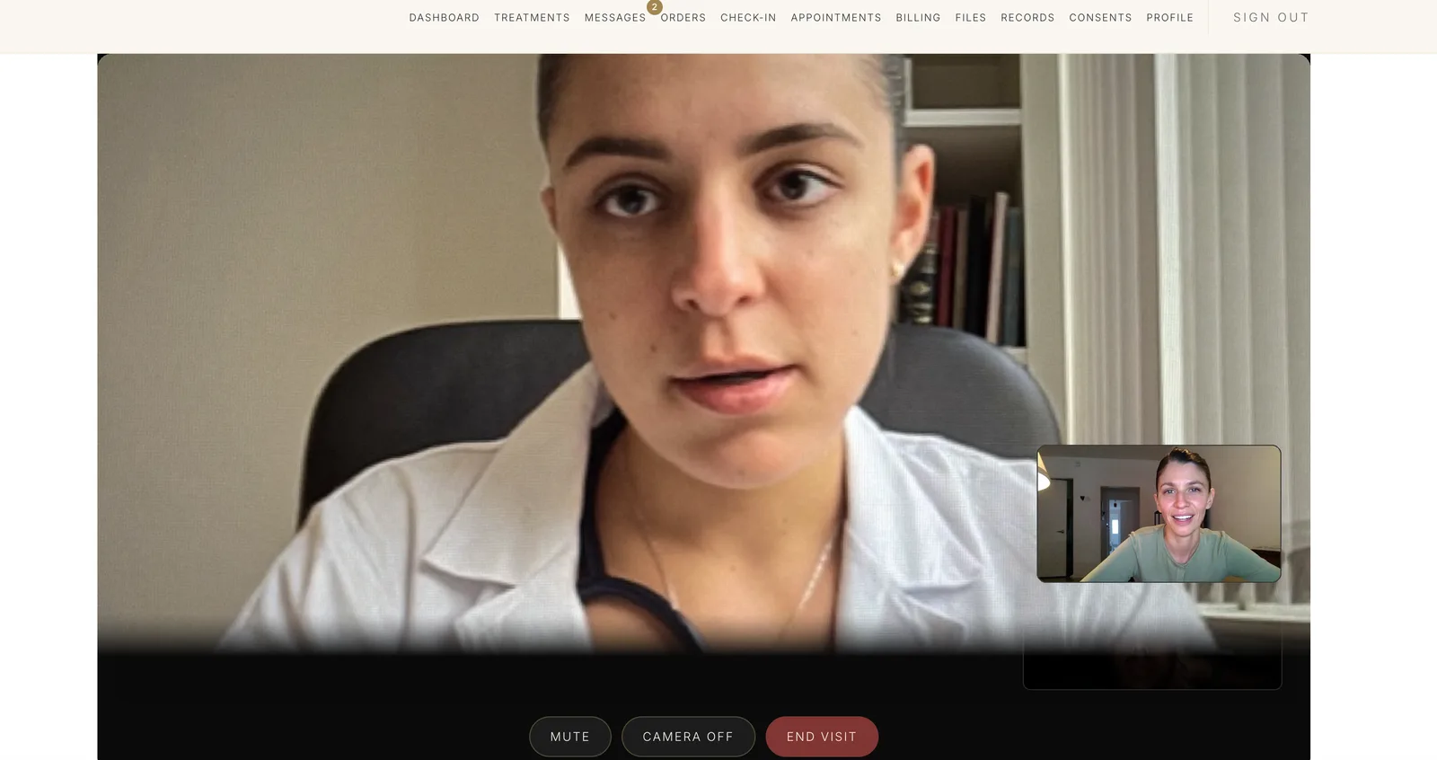
Booking and video visitsSelf-scheduled appointments with a branded waiting room, joined from the browser with nothing to install.
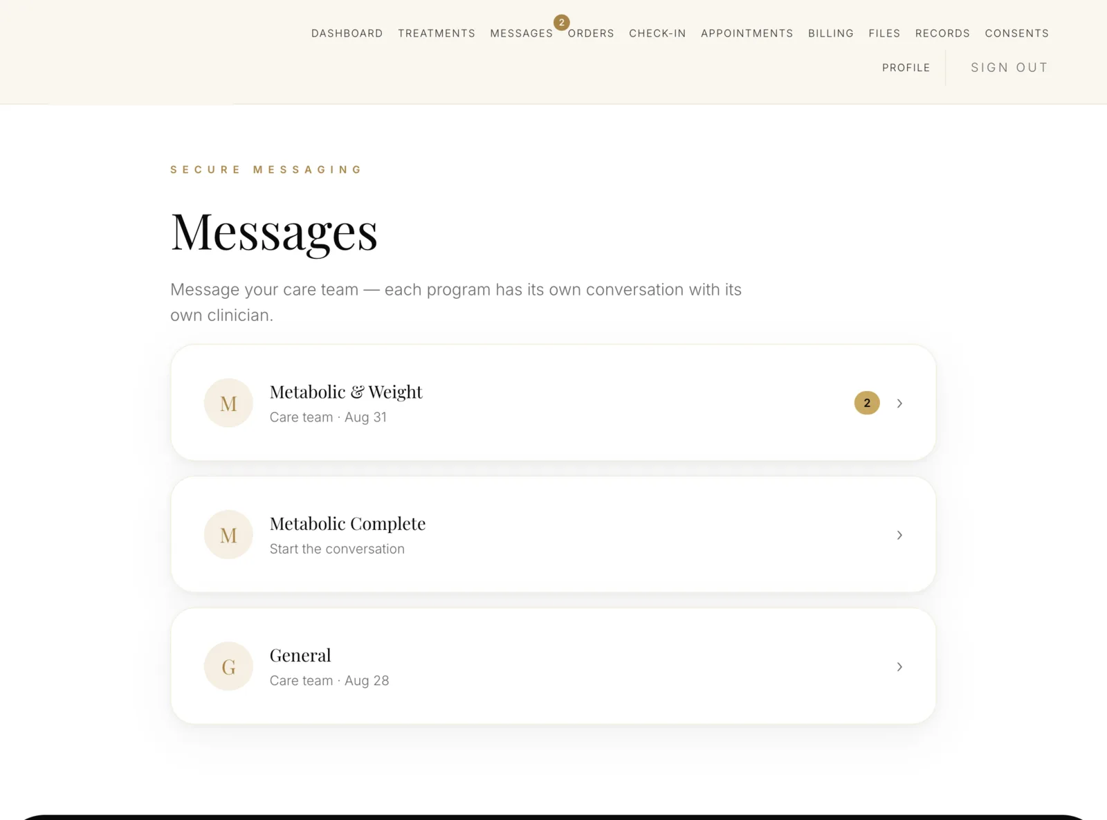
Encrypted messaging with the care teamThreaded, in-portal, and never email — with routing to whoever is responsible for that patient today.
Treatment, refills and shipment trackingCurrent medication, dose schedule, titration guidance, refill requests and where the package is — in one place instead of three emails.
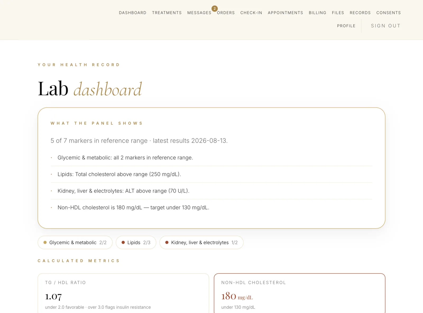
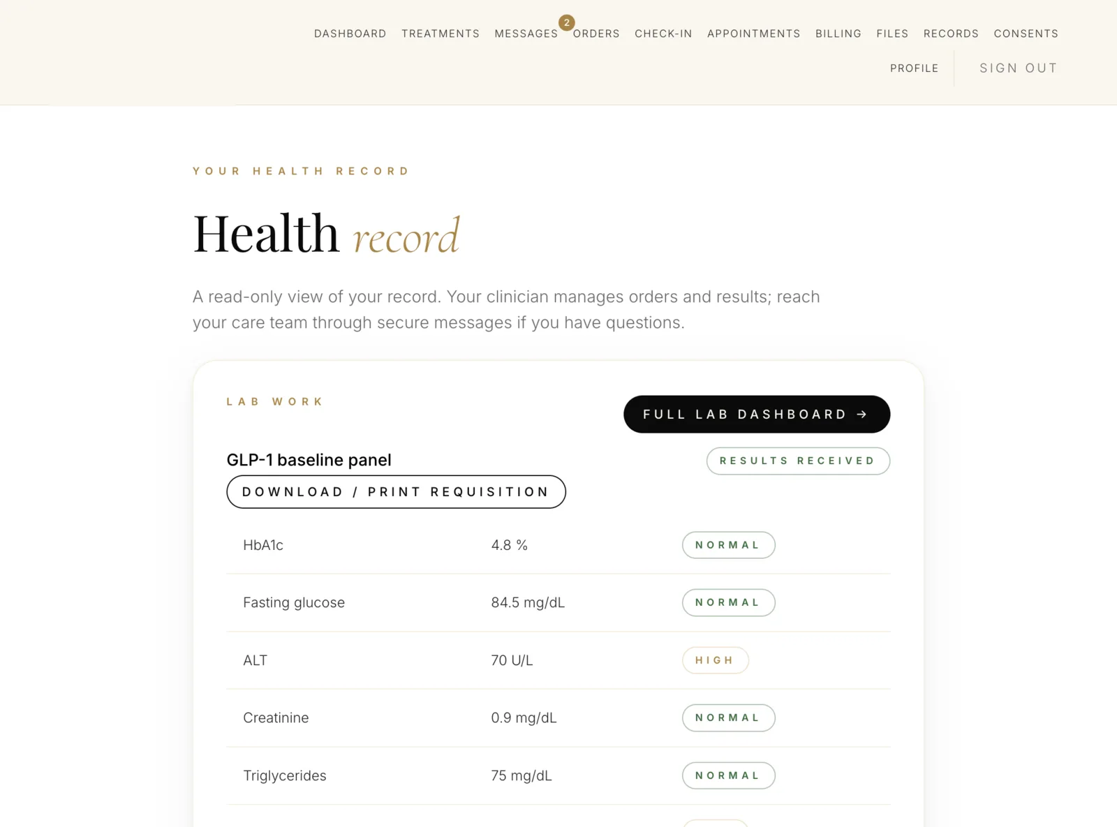
Labs and results the patient can readRequisitions, draw locations and results returned with trends and plain-language context — abnormal values flagged to the clinician, not left for the patient to interpret alone.
Checkout and subscription managementPayment, plan changes, pauses and cancellations — processed on your merchant account, under your descriptor.